Few things evoke more emotions than color. We even use colors to describe emotions. If you are “blue” you are sad. Red roses signify true love and passion. Colors have meaning that transcends emotions. For years blue was an absolute for baby boys and pink for baby girls. White was for the brides and black was for the formal ties worn at after five o’clock affairs. Colors can also be nostalgic and transporting. If someone utters “avocado green” or “harvest gold” people of a certain age will immediately be transported to a 1970s home. Caribbean blue might remind someone of a wonderful vacation just as Tuscan gold can. The significance of colors can change over time and through cultures. In the 19th century brides often chose blue, and in Asian cultures, white is the color of mourning.
The world we live in today is truly vivid. Jumbotron billboards in Times Square, huge televisions in our homes, and the ever-present phone in our hand-deliver high-definition colors to our rods and cones at lightning speed. Everywhere we look we are practically assaulted by colors. To help us try to sift through the plethora of colors, The Pantone Color Institute has issued a “Color of the Year” every year since 2000. Pantone, which is headquartered in Carlstadt, New Jersey, is a company best known for developing proprietary colors for the industry—think Tiffany blue.

In 2017 Pantone named “Greenery” as the color of the year— “a fresh and zesty yellowed green.” Almost immediately we saw brides asking for all greenery bouquets. In 2018, Pantone named ultraviolet as the color of the year. That trend was a little slow to catch on, which is surprising since ultraviolet light in the science of color has a higher wavelength frequency than other colors! Eventually, we saw couples choosing blue-purple hues for accents in their wedding florals with greater frequency (pun intended). In December of 2018, it was announced that “Living Coral” would be the color of 2019. Joseph and I patted ourselves on our backs because we had painted our front door coral the previous summer after a trip to Charleston where we saw shrimpy coral doors on several historic houses. Of course, that was a nostalgic and emotional choice for us, as it reminded us of a wonderful vacation spent in that lovely city. (I once painted a door marine blue after a trip to London’s Notting Hill for the same reason!)
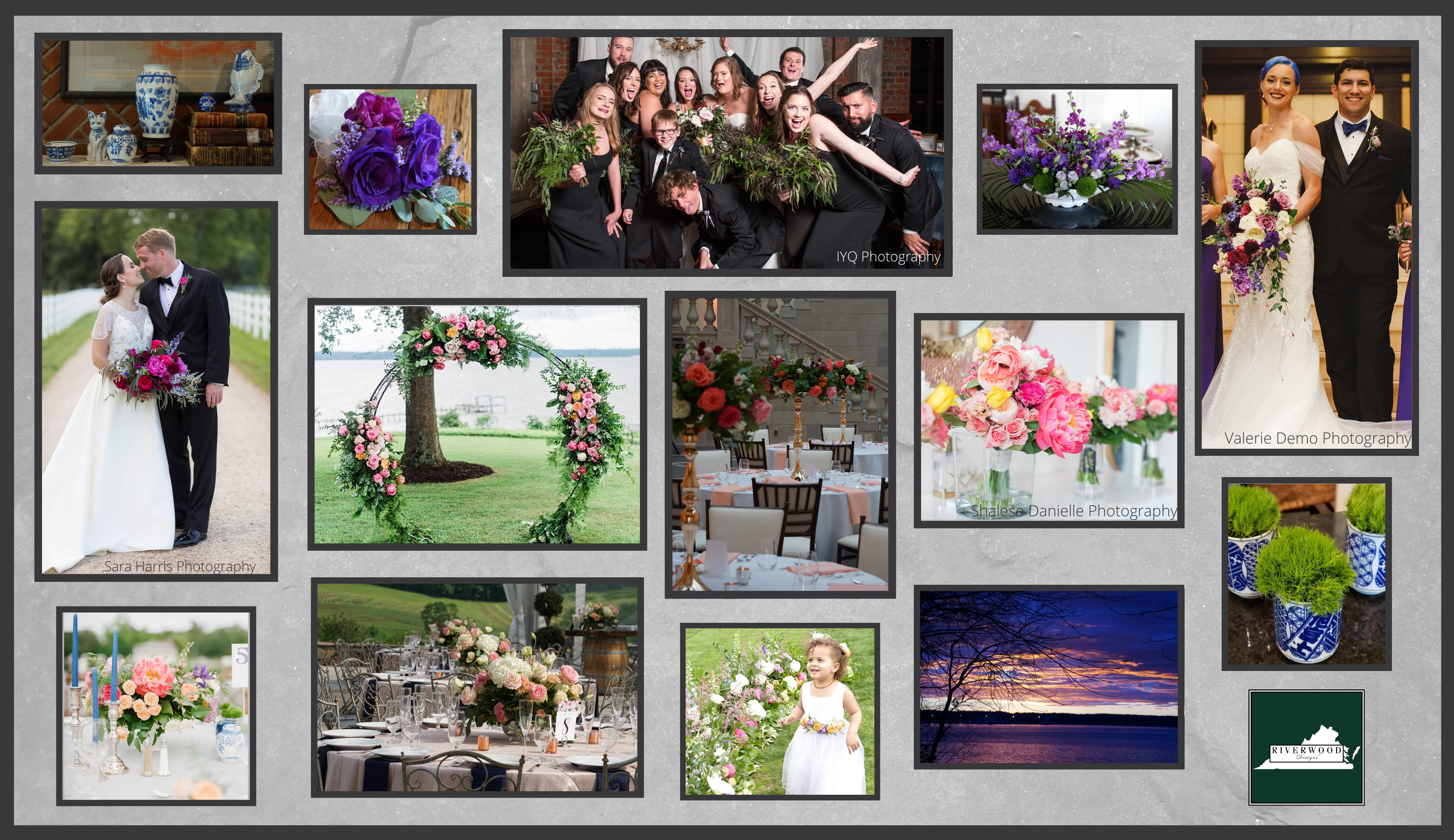
Chelsea embraced “Coral Charm” peonies as the focus of her wedding color palette at Lewis Ginter Botanical Garden.
Pantone clearly chooses their colors of the year as a result of watching what early adapters in the tremendous arena of design are doing. These hues are wonderful suggestions of what “on trend” colors are. Some of the couples we work with are very interested in trends, and color certainly is an important part of any couple’s wedding day. Experts in wedding design recommend choosing a palette of complementary colors and an enhancing metal color. Still some bewildered couples wonder how to incorporate a color trend into their big day. Obvious choices are bridesmaid attire and floral designs. Less obvious choices may include ribbon streamers for bridesmaid bouquets, neckwear or pocket squares for groomsmen (if the wedding is not black tie), vessels for floral designs, and reception table linens.
This year’s color of the year, “Classic Blue,” would be amazing as the color for bridesmaid gowns or it could be brought into the reception in the form of blue and white Chinoiserie vases holding mounds of fresh, white hydrangeas, or even as a gentle nod in the reception candle color. There are very few true-blue flowers and dyed blue flowers must be avoided like the plague; therefore, couples and their floral designers must be savvy in incorporating this color.
As


